| Jimmy Talarico | Artist |
From the notebook…
|
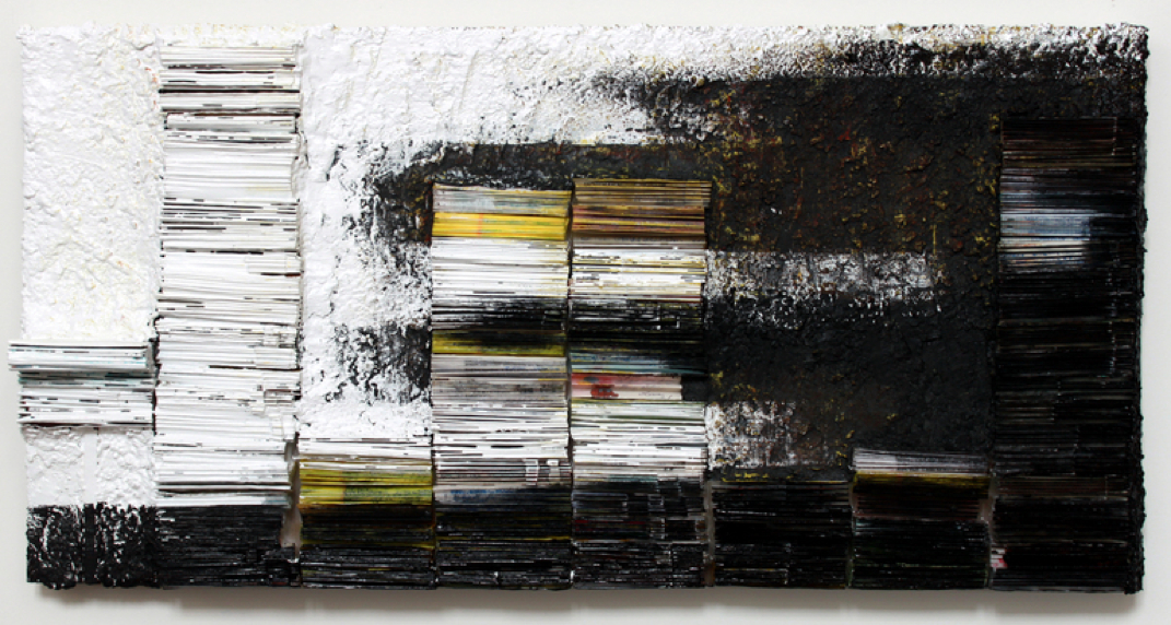
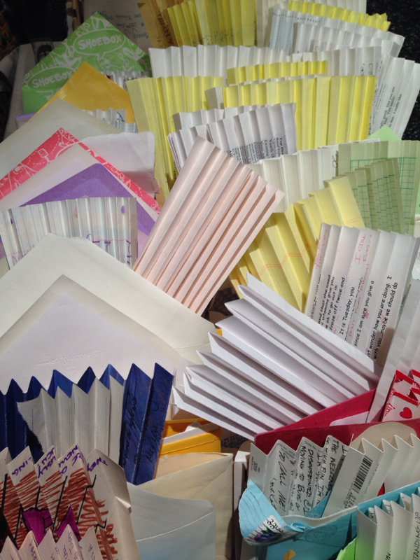
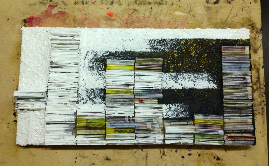
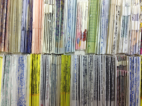
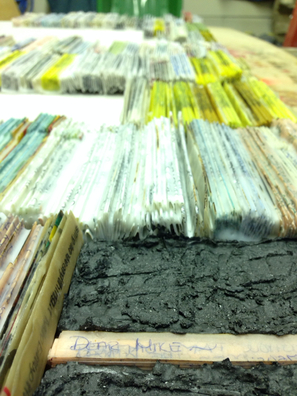
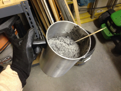
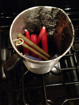
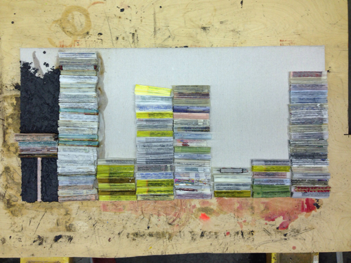
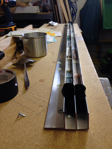
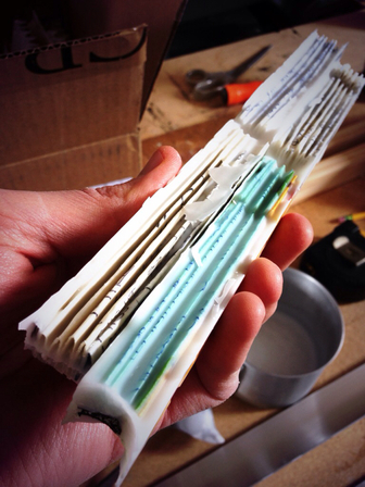
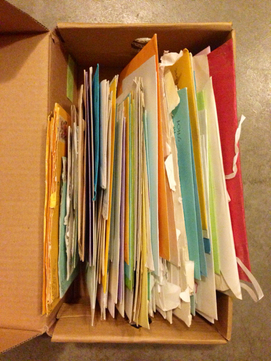
First of all, I realize some of you who follow this site may not follow our Facebook page so you may not have known I was off social media for a week as a part of a media deprivation exercise I was doing. It was a task for a study I'm going through on increasing creativity. I look forward to sharing more about it later. And now, on with the show... So this is a recap of the Dear Mike project I completed a couple of weeks ago. I'm writing this blog to give some insight into the symbolism and decisions I made throughout this process. To begin with, this was a project I was asked to create as a wedding anniversary gift from a wife to her husband. I was given a box of letters the couple wrote each other before they were engaged and was given complete liberty in finding an appropriate way to express them. I'd done another project where I used wedding cards to create paper mâché, but for this project I felt it was important to retain the letters to some degree. The letters were private, but I wanted some words to be discernible so the couple could be reminded of those memories while reading the few words that would remain. The interesting thing about our memories is that we tend to fill in the blanks as we see fit. We never truly remember an experience as accurately as it happened, there is always conjecture. I wanted to give a place for that conjecture to stir up old memories. To do this I decided to fold the letters up line by line and infuse them with wax so they would hold their form. I had seven years of letters and one group with no dates so I split up the letters into eight groups. Then I took the maximum number of letters from one year and divided it by 18" (the height of the canvas) to get 3/4". So I created jigs out of aluminum angles to form 3/4" wide folded letters. The density of each letter within this 3/4" jig showed how long the letters were. This mathematical approach seemed appropriate since both my client and her husband are engineers. I used a similar approach for the width of each letter so each column was 4 1/4" wide. I then melted each letter to a canvas to give the basic layout. I filled the rest of the canvas with wax and ash, which has become my current medium of choice. The wax is repurposed from thrift store candles and the ash is from burned consumable waste cardboard. I know this may sound weird but it really becomes a terrific metaphor for hope and beauty. The candles were most likely originally purchased to celebrate an event centered around love; birthdays, weddings, romantic dinners, etc. But for some reason they lost their value and were given away for nothing. The burned cardboard is symbolic of purifying something that would otherwise be deemed garbage. Both products are then used to create a new object of beauty. After the wax and ash were applied to Dear Mike, I covered them with acrylic paint in colors that complimented the colors of the letters, but I wasn't completely satisfied with that layer. During a critique with Melinda she said, "Why don't you just try black and white?" I thought about it for a while then realized it fit well with the concept. There is a certain naïveté that comes with new love. It blinds us to certain shortcomings in our partner and allows us to simply be enamored. This is represented by the white paint covering most of the beginning sets of letters. But the black comes in from the side of the future as a way to represent uncertainty or times of struggle. See, the truth of love is not found in the black or in the white, either one alone is incomplete. The truth of love is only realized when the two meet. Because any of us who have been married past the honeymoon stage have at some point come to the realization that love is a choice. It's not a funny feeling you get when you're around your partner; you learn that that feeling comes and goes. No, the real strength and beauty of true love happens the moment you recognize that flutter has faded and you decide to remain in love anyway. And with that you get Dear Mike. Congratulations Kathi and Mike on another wedding anniversary and here's to many, many more. Thank you so much for giving me the honor of contributing to your story. And to everyone else, thanks for taking the time to read this. We sincerely appreciate it.
0 Comments
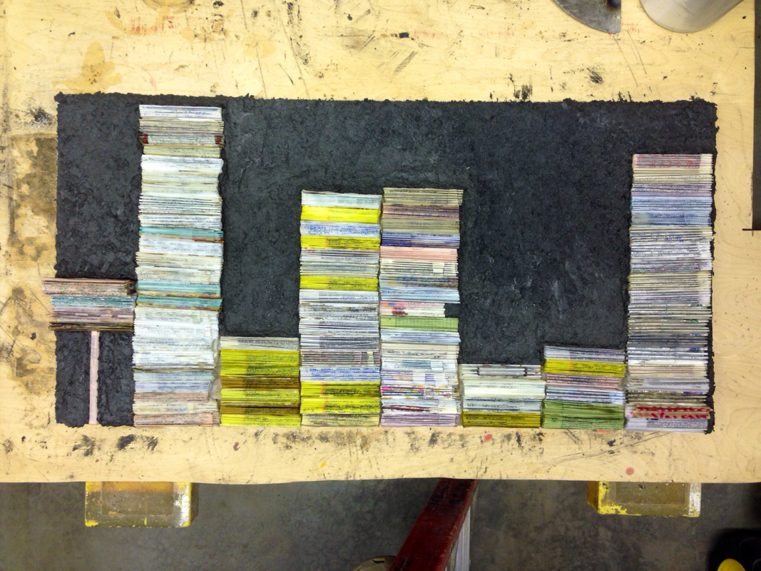
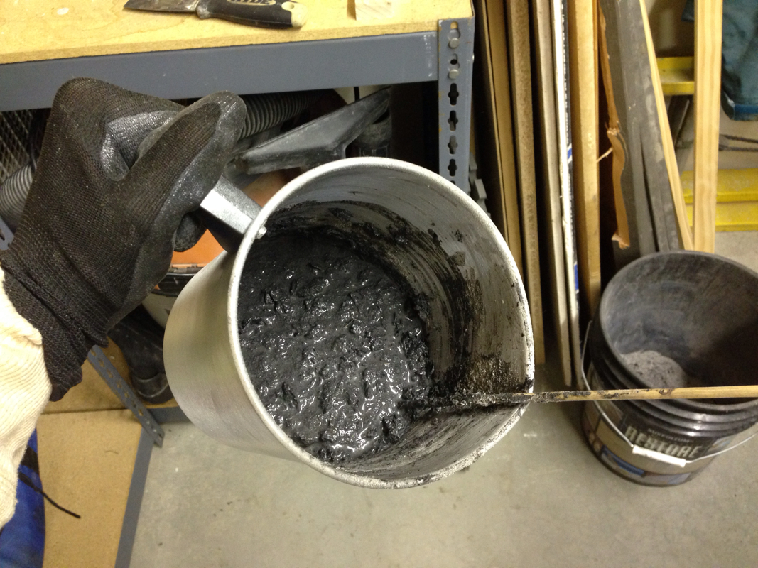
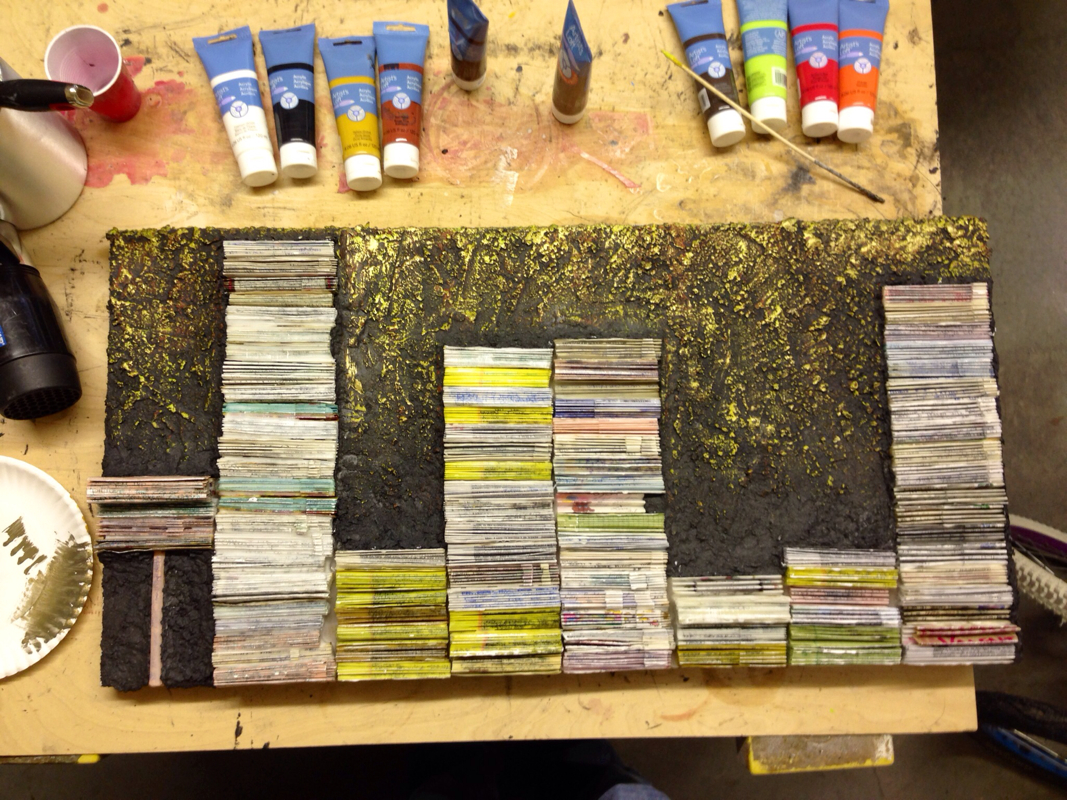
Quick progress update. The letters are stacked and getting melted onto the canvas. Their height and density show how many letters were written each year and how long each letter was. What's the black stuff? Good question. It's a combination of ash and wax. Really?... Why ash and wax? Another good question. They are both symbolic and functional. You see, my overarching interest with my art right now focuses on Value and Memory. I use ash from burned cardboard and paper waste; fire and burning has always been a metaphor for purity. So it's a way to repurpose something of no value to give it new value. As for the wax, I prefer to use candles I find at thrift stores. Thrift store items are compelling to me. Yes, Melinda does think this is weird. :) But let me explain. Everything in a thrift store was once purchased by someone because they valued it. Then somewhere along the way it was discarded as waste. If you look at candles specifically, they were typically purchased for very special moments: birthdays, weddings, romantic evenings, etc. But at some point they were given up. Why? Was there a death or did a relationship end or did the kids move out of the house? Whatever the reason, it marks a point in someone's life when that purpose for buying the candles lost value. So I like to think that I'm honoring those initial memories by using these materials for art. Specifically for this piece, it's the perfect marriage of concept and material as a way to preserve and display these love letters which may never be discarded. So my first client is an engineer. Turns out her husband, for whom this piece is being created, is ALSO an engineer... and I need to make something that is about them and that they will love. Well that sounds easy enough..... Right. :) The solution? I've created a system based on math (probably something fancy like derivatives, whatever those are) that will be used to display these letters. I started with the dimensions of the piece, 18" x 36". Then I took the number of years represented (which is 5, plus a misc. stack of undated letters) and the number of letters in each year (which varied dramatically) to determine that each letter had to be contained in a 3/4" x 4 1/2" block. The third dimension, height would vary based on how many pages were in each letter. Wow... That's all quite a mouthful. But I know my client will most likely check my math and appreciate the "engineering" behind the art. It's just another layer of taking these Memories To Masterpiece. I'm excited about this one: Here we go. First official commission!
I was given these special letters and cards that were shared between a couple while they were dating and engaged. This will become an anniversary gift for one of them this year. What a humbling opportunity to share in preserving someone's memories! "You mean you can make art out of something other than flowers?" you might ask. Look, if it's special to you, I'll find a way to honor it as fine art. Stay tuned to see where we go from here... |
Jimmy & Melinda TalaricoFrom here you can read our opinions on our industry, updates on our work, and pretty much anything else we'd like to discuss. Dialog is appreciated so please comment! Archives
August 2023
Categories
All
|




 RSS Feed
